walletii
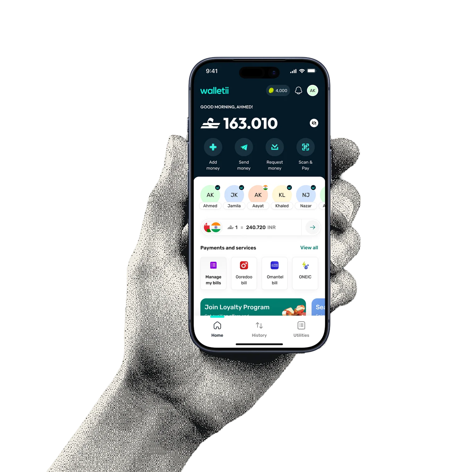
I joined as a product designer in 2025 and design across the app, from payments and remittance to loyalty, cards, and onboarding.
Most work starts as product requirements from the team, and I own the interaction and UI design that turns them into shipped screens. A few pieces are worth going into, from a change that affects how the whole app reads, to loyalty, remittance, and the parts of the product shaped by regulation.
Design systems are the part of the work I care most about. At walletii that has meant three things: a rule for what you can tap, variables that switch the app between markets, and the upkeep that keeps it all in good shape.
making it clear what you can tap
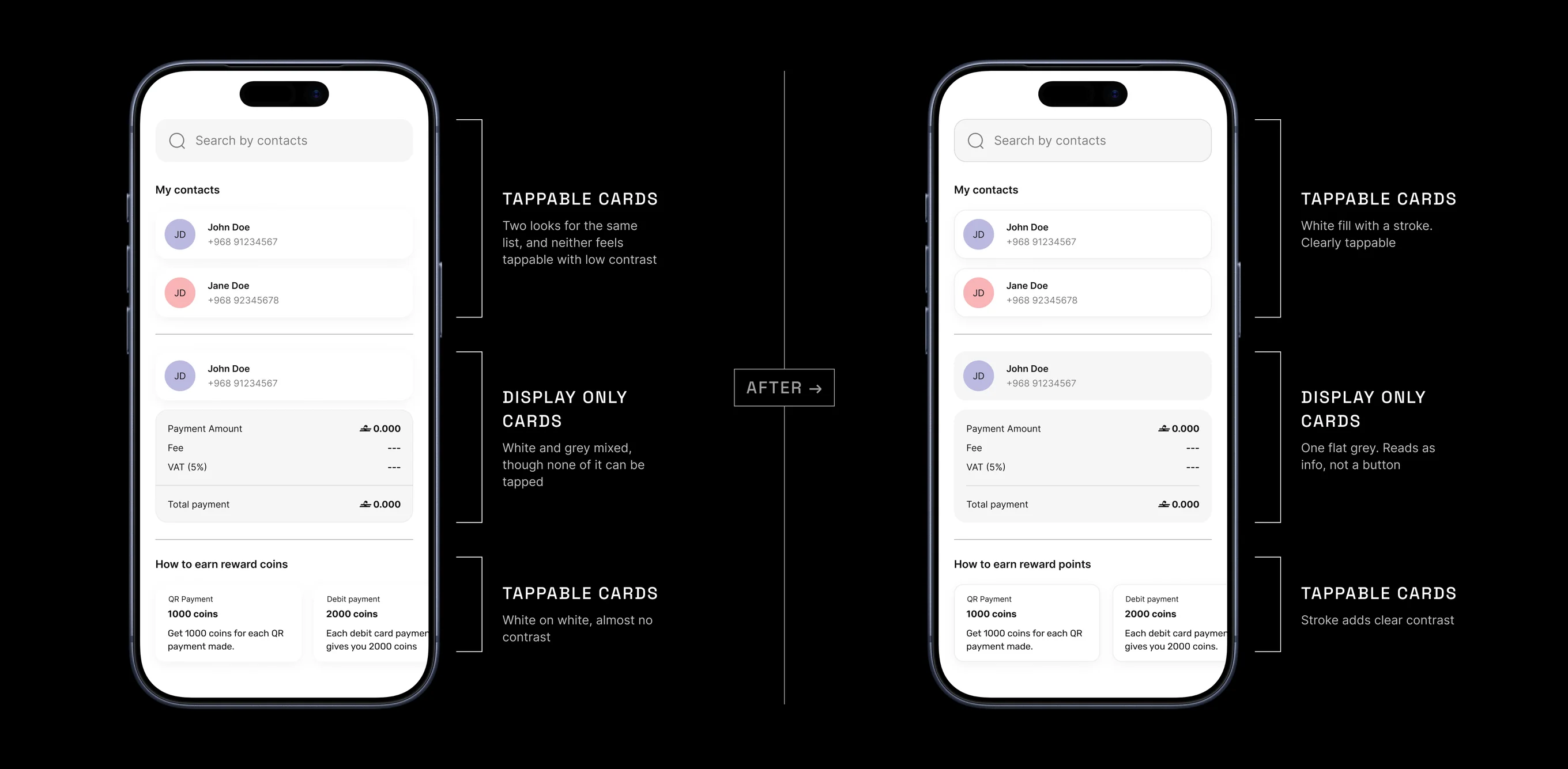
Across the app, our white cards had drifted. Some had a grey stroke, some only a shadow, and the contrast was so low that on a white screen you could not always tell what was a button and what was just information. It came up as a consistency problem, but underneath it was a clarity problem. People could not tell what was tappable.
So I worked out a simple rule and built it into the design system. Anything you can tap gets a white fill, a grey stroke, and a soft shadow. Anything you cannot tap gets a flat grey fill. Input fields kept their grey fill, since that was already familiar, but got a stroke so they read as their own thing rather than as static content. One rule, applied everywhere, so the whole app speaks the same visual language.
I rolled this into the design system and the build file first, ahead of the new screens and journeys, so everything after it was designed the right way from the start instead of being fixed later.
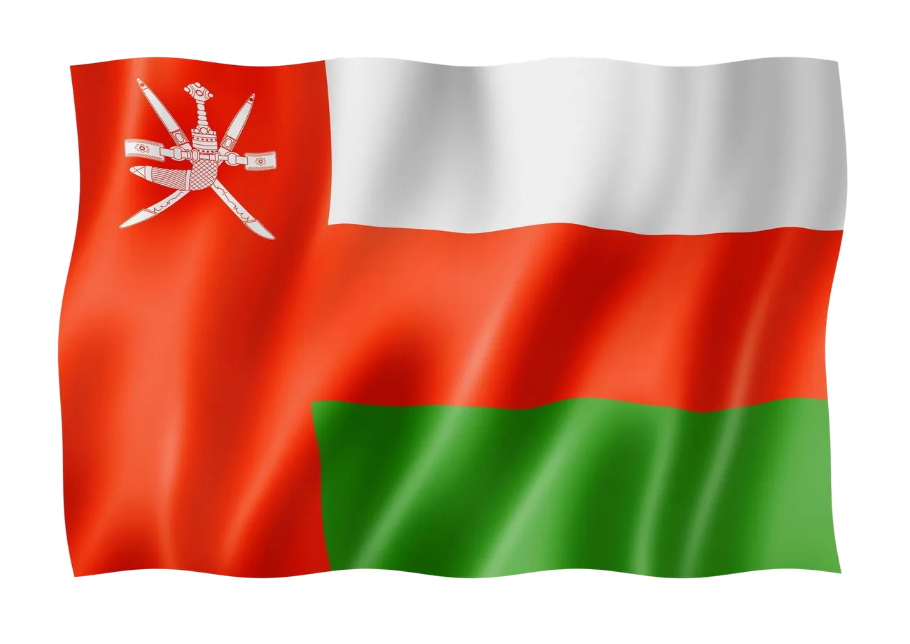
walletii runs in more than one market, and each one has its own currency, its own formats, and its own small differences. Rather than rebuilding the screens for every market, I set up market variables in the system, so the app can switch all of it from one place.
Change the market, and the currency, the formats, and the right component variants all follow. Adapting to a new market becomes closer to flipping a setting than redrawing the product, and every market stays consistent because they all draw from the same source.
O 40.000
sent to
Nadhira Harthy
 Oman
Oman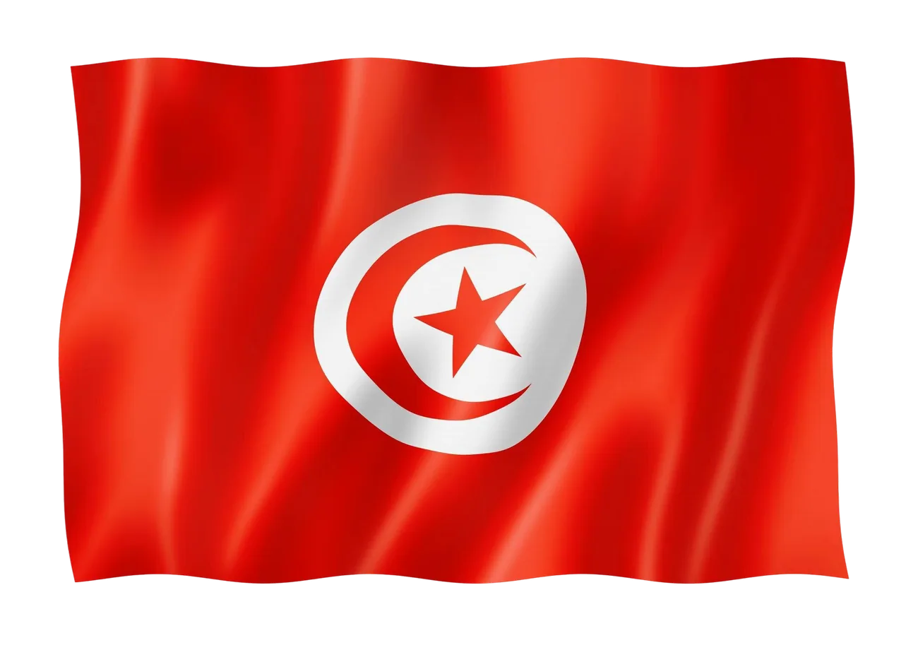
40,000 TND
sent to
Youssef Hannibal
 Tunisia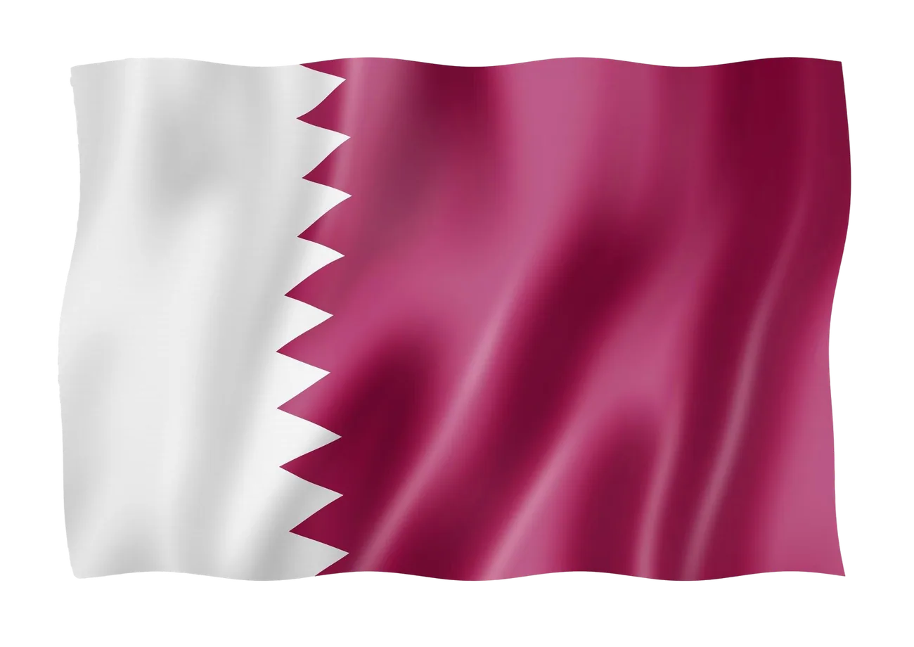
40.00 QAR
sent to
Mohammed Thani
 Qatar
QatarOn top of that I handle the upkeep, keeping the system current as Figma ships new features. Lately I started moving components over to slots, which makes them more flexible and faster to build with. It is the quiet maintenance that keeps a system from slowly falling behind.
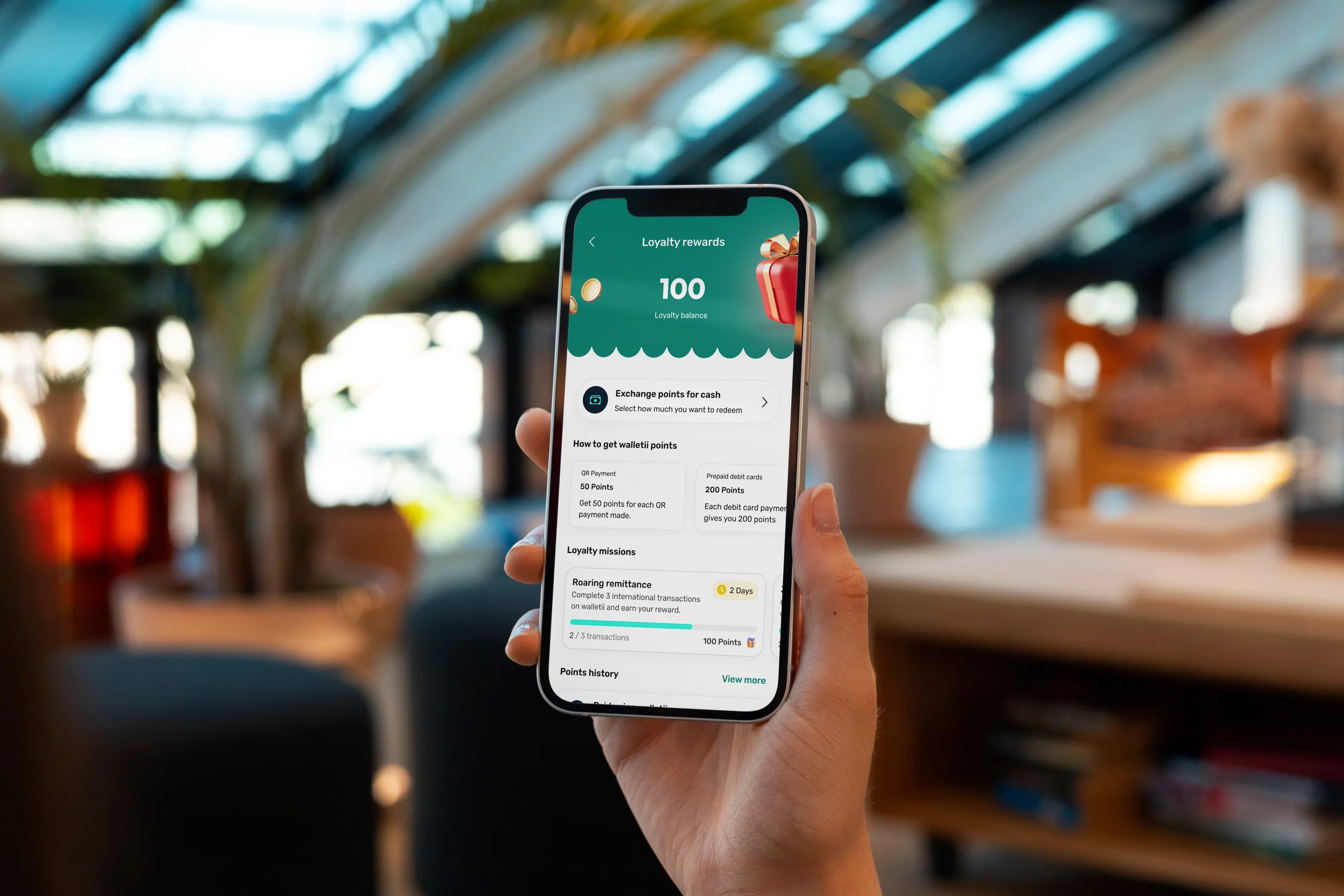
Loyalty is one of the areas I work in. Users earn points across actions like bill payments, transfers, and referrals, and spend them on rewards like data and cash. As more reward types were added it got harder to read, so I designed the reward cards, the detail views, and a view all screen that keeps a long list scannable, all built on the same card rules as the rest of the app.
One small call I like was on rewards a user cannot afford yet. Instead of hiding them, we show them with how many points are left to go, so a locked reward reads as a goal rather than a wall.
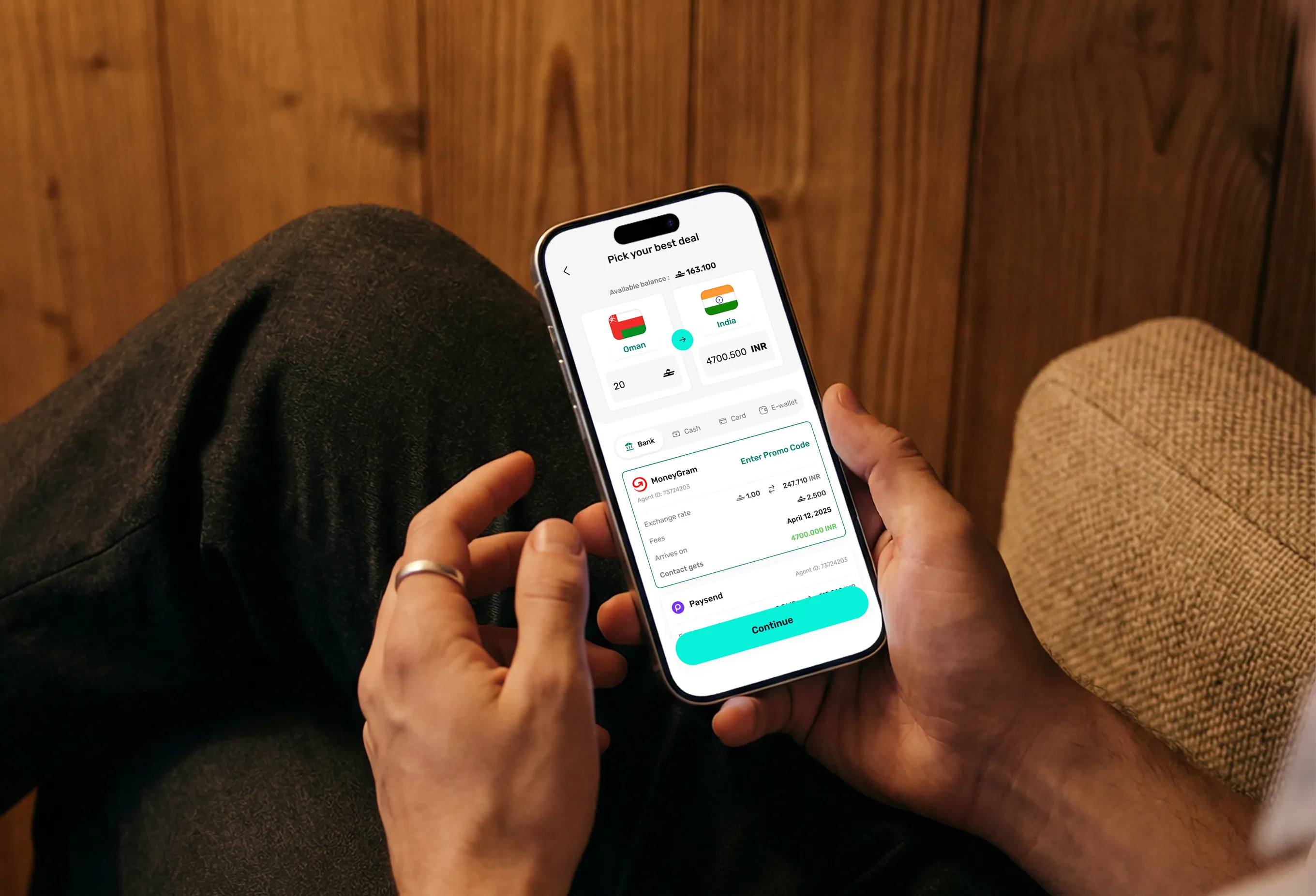
A large part of walletii is international money transfer, and it is some of the hardest design work in the app. Money moves across different corridors and providers, and the flows have to hold up across currencies, languages, and the rules of each market.
I focused on the parts users actually struggle with. Managing beneficiaries when someone sends to the same person across different bank accounts, or to several people who share the same name. And a flow that nudges cash-pickup recipients in Tunisia to collect their money in the app instead of traveling to a branch, which is easier for them and brings more people into the product.
When someone in Oman sends cash to Tunisia, the recipient still collects it at a branch, even though walletii runs in Tunisia and could hand them the money in the app. The catch was that we had no direct way to reach the recipient. walletii never takes their number, only the payment provider has it, and we cannot change the provider's text message. So the only real channel left was the sender.
So I designed a short, ready to send message on the sender's success screen, in English, French, and Arabic, that they can copy and forward to invite the recipient to download walletii and collect the money in the app. It turns the sender into the channel we did not otherwise have. The team backed the approach, and it is in development now, not yet live.
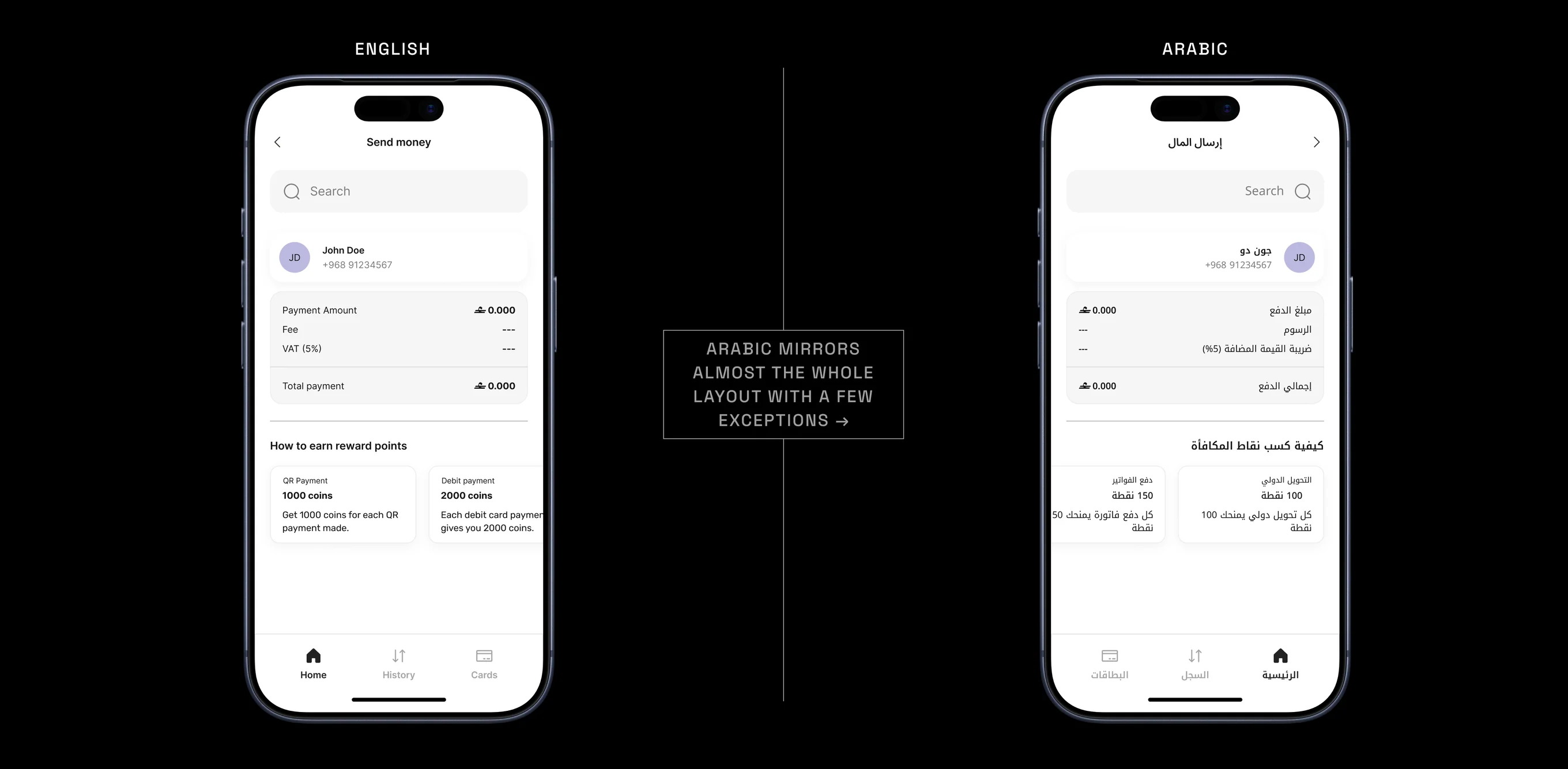
walletii ships in English, French, and Arabic, and Arabic is written right to left. That is more than translated text. The whole layout mirrors. Navigation, icons, alignment, and the order things sit in all flip, so the app has to feel native whether it reads left to right or right to left. Designing every screen to work both ways, and keeping it consistent across all three languages, is a constant part of the work.
A wallet in these markets lives inside financial regulation, and a lot of the work is making the rules feel like a normal part of using the app. I designed flows like a cooling period that lets new users start right away while some actions stay limited until their account is fully reviewed, a geolocation check required by the Central Bank of Oman, and the steps for raising wallet limits through extra verification.
The aim is always the same. Keep people moving, and stay inside the lines without making them feel it.
Across the year I have shipped in these areas of the wallet.
-
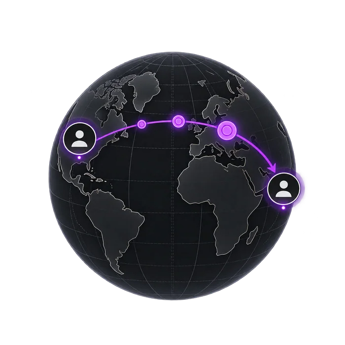
remittance & IMT
-

Loyalty & Rewards
-
cards
-
kyc & onboarding
-
payments
-

account management
Alongside the product work, I made a set of 3D icons for walletii. Modelled and rendered in Blender 3D, and it is a part of the craft I enjoy.

More Work SEE ALSO
More Work SEE ALSO
More Work SEE ALSO
More Work SEE ALSO